
How to Design Effective Data Visualisations (edited for empathy.co)
The Value of Data and Data Visualisations
Whether you’re writing an email, checking your tweets, streaming some music, or Googling life’s most important questions, such as “Can dogs see colours?”, these routine online actions generate large amounts of data. Usually, without us even being aware of it.Not along ago, a business would make money on the internet simply by selling access to their services, programs, or applications. However, as competition has increased and purchasing trends have changed, more and more of these products are now being offered for free. This isn’t because these businesses are suddenly feeling more charitable, they’re still turning a profit. They’ve just worked out another way to make money. Can you guess what it is?The use of advertising goes some way to enable a business to offer their programs and tools for free, but it’s disruptive and isn’t the most lucrative. By far and away, the biggest facilitator is the data we generate when using their tools and apps. That data is worth far more than any fee we would choose to pay. If you know what to do with it, data has a lot of value.Whether or not you were aware that you leave a digital footprint as we browse the internet, most people would be surprised at how large that footprint is. The amount of data we all generate on a daily basis is staggering.Domo’s Data Never Sleeps 6.0 gives us an idea of the volume. Their report predicts that by 2020 every person on earth will generate 1.7 megabytes of data every single second. That’s 146.88 gigabytes a day. According to ScienceNewsForStudents’ calculations, that’s the equivalent of all the words from a shelf of books that’s over 2.6 kilometres long.Population Pyramid estimates that the world’s population by 2020 will be around 7.76 billion people. This means the total volume of data generated on a daily basis would be 1.14 zettabytes. If 1.2 zettabytes of data were to be printed in book form, it would be able to cover the entire surface of the Earth in a layer 52 books deep. As the global population continues to grow, and more and more people gain access to the internet, those numbers will rise exponentially.While those are some pretty huge numbers, what can be achieved with that data is even more impressive. For example, we use data to help us predict the future by identifying what people are looking for on an online store before they’ve even typed a query.The problem is, in their raw form, most datasets are simply too large for us to comprehend.Large numbers are difficult to get your head around. Trying to draw comparisons between two of them is even harder. If you were to see two car parks, one with only 10 cars in it and one with 100, you’d easily be able to tell the difference. But, what if you saw a car park with 10,000, 100,000, 1,000,000, or even more cars? When dealing with volumes of things that have five or more digits our minds struggle to differentiate between them. Miller’s law, argues that the maximum number of object an average human mind can hold in working memory is 7 ± 2. We need help when we’re dealing with large datasets.To realise data’s true value, it is necessary to process and convert it into something that will allow you to see important information, to identify patterns, to understand difficult concepts, to get data-driven insights, and to ultimately make better decisions. Data visualisations are our allies.How Visualisations Can Help You to Understand Large Amount of DataHere’s an example of a dataset that’s difficult to fully understand just at a glance:The table shows the population of five Europe countries. Each country has a value very different from the rest. How long does it take you to work out which country has the third largest population?Here’s the same data, but presented as a bar chart:
See how a simple data visualisation makes the data far easier to digest.Now, let’s try something a little more complicated:The table above shows three more countries with their population size at 10 year intervals between 1967 and 2017. We have 18 large numbers to comprehend and compare. In five seconds, can you tell me which country saw the greatest rate of growth between 1977 and 1997?Once again, here’s that same data visualised to help you find the answer faster:
This might all seem a little obvious. We all learnt about the benefits of tables and graphs back in school. However, the principles that are applied here are the same as those that will be used to understand all that data generated by people interacting with things online. If you can process and visualise data in the right way, it will teach you things you’d have never known otherwise. This is why data has so much intrinsic value, it holds the key to unlock our understanding of practically everything.Creating Data Visualisations: Best Practice
Now that we have a better appreciation for the importance of representing large amounts of data through visualisations, we should discuss how you actually go about doing that. Every visualisation should have its own unique personality; a representation that is bespoke to the data that needs to be communicated. However, the primary goals of almost all visualisations are identical:To reveal important informationTo understand complex conceptsTo identify patternsTo get data-driven insights
With these goals in mind, it is essential that a visualisation is able to say something at a glance. The dataset should be read and understood with little effort. It needs to be represented as clearly and concisely as possible. For this, it is necessary to choose the correct charts, colours, and shapes to suit your specific data. A visualisation that requires a lengthy explanation is a bad visualisation. This will usually be because someone has not put enough thought into how to display the data or they’ve attempted to display too many details.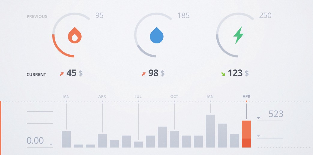
In the pursuit of ‘at a glance’ intelligibility, any fields that are not required for a base understanding and other extraneous details should be kept hidden. You can always make the visualisation interactive and give the option to reveal them by displaying further details. If you do provide interactivity, it is always recommendable to use transitions and animations that clearly illustrate what has changed. This will help to guide the audience’s understanding and adapt the data to their needs without them getting lost.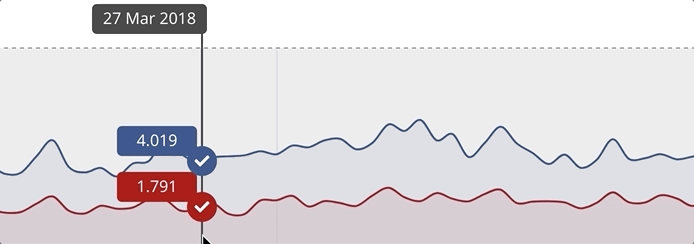
But creating a clear and efficient data visualisation isn’t just about design decisions. To start with, you need to determine the purpose of the visualisation and define what data to include. After these have been decided and the design has moved through several iterations, the visualisation will need to be developed. If you haven’t involved a developer before this, it is usually only now that the data’s or the design’s shortcomings are identified. To be successful, the production of a visualisation requires a range of diverse skills and viewpoints throughout the entire process.On top of this, you should also ensure that you document the project’s lifecycle well. Keep a record of things like exactly what data you’ve decided to display, the various versions of the visualisation’s design, and make a to-do list. It’ll help to keep everyone on track and working towards the same goals.Designing an effective data visualisation isn’t about making numbers look pretty. It’s an exercise in clear visual communication. To make sure you’re on the right path, and create visualisations that are both useful and aesthetically pleasing, you should ask yourself the following questions:What data do we want to display? Before you do anything else, decide on the data that the visualisation will display, what its goals are, and what it may possibly reveal. Each visualisation should have a clearly defined goal to drive its creation.What do we need to fully understand the data? Following on from the previous question, you will need to decide what you’ll need to fully understand your data. You need to give some thought to whether you need to compare data sets, whether there are any required data range adjustments, and what the most important things to highlight will be.Will this be understandable ‘at a glance’? Your visualisation must be able to communicate what it needs to almost instantly. Continuously review your designs and simplify them where possible. This will take a lot of thought and effort, but be patient. This is essential for an effective visualisation.Do we know our audience? Even if it’s for yourself, consider who will be using your data visualisation. What will they want from it? How are they likely to interact with it? What do they already know? Your data visualisation should be designed and built around theirs needs.Are we presenting the data accurately? It can be easy to make mistakes. Make sure you’re presenting all data accurately and transparently. Watch out for mixing up axes or distorting data by not starting an axis at zero. Think about how your design decisions may cause data to be misinterpreted, whether intentionally or not.Are we trying to include too much? Once you get started it can be easy to fall to temptation and add more and more data details to your visualisation. Don’t do it! A visualisation can either communicate one thing very well or lots of things badly. Give your visualisation a single target and stick to it. If it feels like adding that extra detail is 100% necessary, still don’t do it! What you need is another data visualisation, not more data details.Can we make this interactive? Creating an interactive data visualisation, complete with transitions and animations, allows users to configure it to theirs needs. It enables them to filter the data set and gives the option offer more details for a specific section. In short, it allows users to ‘play’ with the visualisation. This can be fundamental to them developing understanding and gaining insights.
In Conclusion
Data visualisations can be very powerful as long as they are created following the principles we have discussed. They should bleed into every stage of your visualisation’s production, from the early planning, through the design, and during building.As the data we generate and have access to continues to grow, so too will the importance of using visualisations to comprehend and analyse it. They are, and will continue to be, integral to making informed decisions and taking appropriate action in our increasingly complex world.